THIẾT KẾ - CHIA BỐ CỤC TRANG WEB BẰNG "GRID"

xuất bản
Thông báo:
Cảm ơn bạn đã theo dõi QuangNinhBay.Com trong suốt thời gian qua.
Trong thời gian tới website sẽ update để bạn có trải nghiệm mượt mà hơn. Nội dung về thiết kế website cũng như các thủ thuật sẽ được đội ngũ QuangNinhBay.Com Update thường xuyên hơn.
Xin cảm ơn!
Xin chào các bạn hôm nay chúng ta cùng tìm hiểu về thiết kế bố trí (layout) 1 trang web bằng grid nhé.
Đề bài:
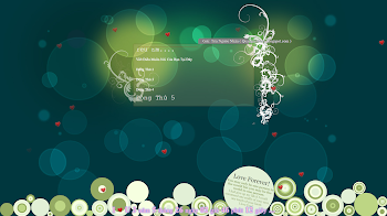
Sử dùng Visual Studio Code để thiết kế layout dạng như hình sau:

Sau đó sử dụng bố cục trên và đưa nội dung văn bản và hình ảnh tương ứng vào từng phần đã định sẵn như hình sau:


Hướng dẫn:
- đầu tiên chúng ta tạo 1 file index.html
CODE tham khảo HTML
<!DOCTYPE html>
<html lang="en">

<head>
    <meta charset="UTF-8">
    <meta name="viewport" content="width=device-width, initial-scale=1.0">
    <title>Bài 2</title>
    <link rel="stylesheet" href="./style.css">
</head>

<body>
    <div class="container">
        <div class="body_t">
            <h2>QuangNinhBay.Com</h2>
            <p>Typography
                Let’s face it: the core purpose of all web design is communication. Whether we’re talking about
                an online retail store, a web presence for a Fortune 500 company, or a profile for a social
                networking site, typography is a vital component. For most people, typography is simply about
                arranging a fa-miliar set of shapes to make words, sentences, and paragraphs. Having the ability
                to set type with only a few strokes on a keyboard has allowed us to forget about the creative and
                artistic possibilities of this medium.</p>
            <p>
                There are numerous obstacles to the effective customization of typography for the Web—and I’ll
                address these in the coming pages—but the power of type should be motivation enough to push
                the proverbial envelope. Unconvinced? Pick up a magazine, turn on a television, or take a walk
                through a grocery store. You will undoubtedly see hundreds of creative and effective uses of type.
                It is the substance of branding, the key to unspoken communication, and an essential piece of the
                web design pie.</p>
            <div class="social">
                <a href="#">Facebook</a>
                <a href="#">Twitter</a>
                <a href="#">LinkIn</a>
                <a href="#">Discord</a>
            </div>
        </div>
        <div class="body_p">
            <div class="body-top">
                <h2>Taking Type to the Web</h2>
                <p>
                    When it comes to theWeb and choosing fonts for text that will be displayed in a browser, it
                    doesn’t matter if you have five, or 5,000, fonts installed; you have to think in terms of the lowest
                    common denominator.</p>
            </div>
            <div class="body-down">
                <img src="https://cdn.baohatinh.vn/dnn/baohatinh/news/1815/102d5060025t6857l0.jpg" alt="" style="width: 100%; height: 260px; object-fit: cover;">
            </div>
        </div>
    </div>
</body>

</html>
* Đoạn code trên mình đã gộp cả yêu cầu 2 vào nhé.Chúng ta tạo một div container để bao trùm tất cả
sau đó tạo ra 2 div body_t và body_p
trong body_p ta tạo thêm 2 div con là body-top và body-down
ok vậy là phần html ta đã chia xong giờ vào css nhé.
- Tiếp theochúng ta tạo 1 file style.css
CODE tham khảo CSS
.container {
    border: solid 2px #425fdd;
    padding: 20px;
    width: 97%;
    height: 670px;
    display: grid;
    grid-template-columns: 1fr 550px;
    grid-gap: 10px;
    background-color: #ffffff;
}

.body_t {
    background: linear-gradient(135deg, #f78356 0%, #ffcc6f 100%);
}

p {
    margin: 50px;
    text-align: justify;
    font-size: 20px;
}

.body_t h2 {
    margin: 50px;
    text-align: center;
    font-size: 50px;
    text-shadow: 4px 5px 10px black;
}

.body_p {
    display: grid;
    grid-template-rows: 1fr 260px;
    grid-row-gap: 10px;
}

.body-top,
.body-down {
    background: linear-gradient(135deg, #f5a07e 0%, #ffcc6f 100%);

}
.social{
    margin-left: 50px;
}
a {
    text-decoration: none;
    font-size: 20px;
    font-weight: bold;
    padding-right: 10px;
}
.body-top h2{
    margin: 50px;
    text-align: justify;
    font-size: 30px;
    text-shadow: 4px 5px 10px black;
}
*Giải thích css: display: grid; /* kiểu hiện thị là grid */
grid-template-columns: 1fr 550px; /* chia columns ra làm 2 */
grid-gap: 10px; /* khoảng cách giữa các khối với nhau */
grid-template-rows: 1fr 260px; /* chia rows ra làm 2 */
Mình chia đôi container ra theo column (body_t và body_p)Sau đó chia đôi body_p ra theo rows (body-top và body-down).
Cuối cùng tạo khoảng cách giữa các khối với nhau và viết nội dung tương ứng vào từng ô như hình.
Chúc các bạn thành công có gì không hiểu bình luận phía dưới nhé.


 Copyright © 2018 - 2022